The Beatles: The Lord of the Rings, originally uploaded by manlyartjpc.
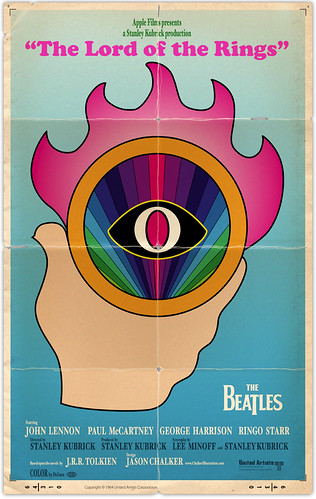
This is my entry. It's definitely inspired by The Yellow Submarine. It was a lot of fun to do. I even went a little nuts and recreated the old United Artists and DeLuxe logos.
I hope you like it! If you want to enter, you still have until 8:00pm pacific time on January 2, 2011 to enter. There are some good prizes.


4 comments:
As I already wrote at Super Punch: best entry both by and so far
Thanks Headsign! I really appreciate it. It was a lot of fun to make.
Everything is so spot on with this poster! The little touches are what sell it completely: The old UA logo, Color by DeLuxe wordmark, trim marks but my favourite by far are the separation marks at the crease intersections. You hate to see them on the real thing but the lend authenticity to this piece.
And before I neglect saying it, the stylistic simplicity of the design is absolutely perfect.
Thanks Badger! I tried very hard to make it look as authentic as possible. It's nice someone noticed the UA and DeLuxe logos. It almost took me as long to recreate those as it did to create the poster art. :)
Post a Comment